

Hey guys,
this is the homepage of Thomas Schäferhoff.
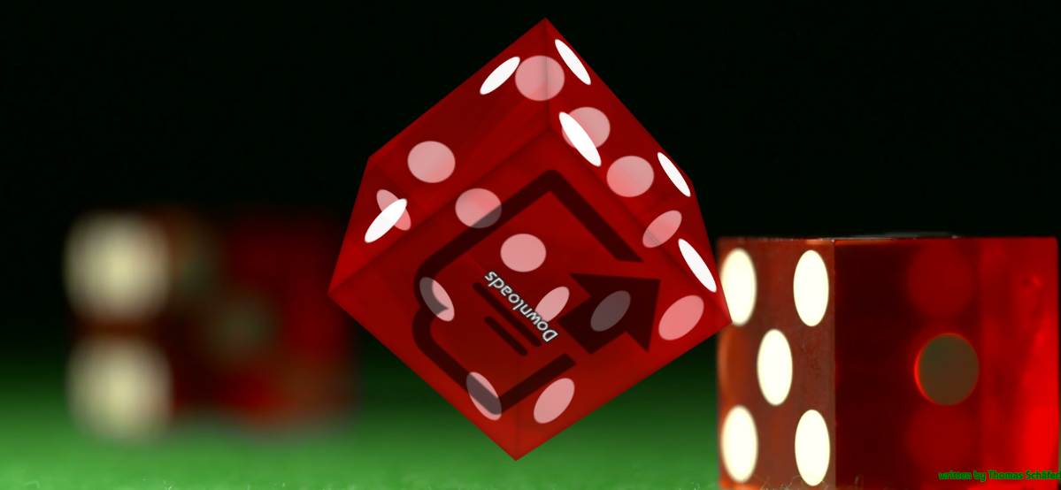
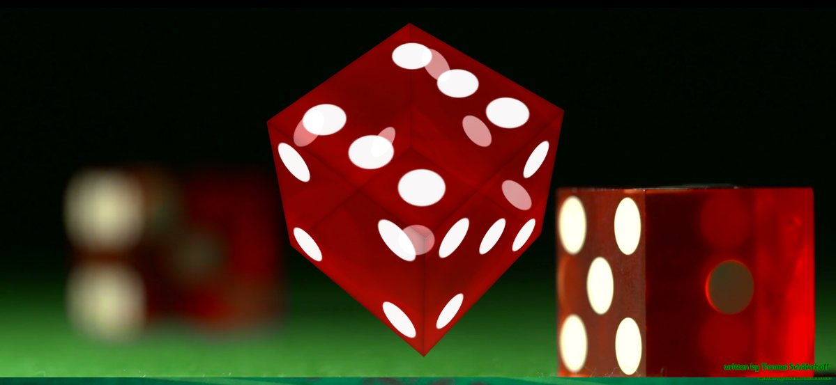
With this homepage I took, instead of a conventional navigation, a spinning cube to change pages.
On each face of the dice
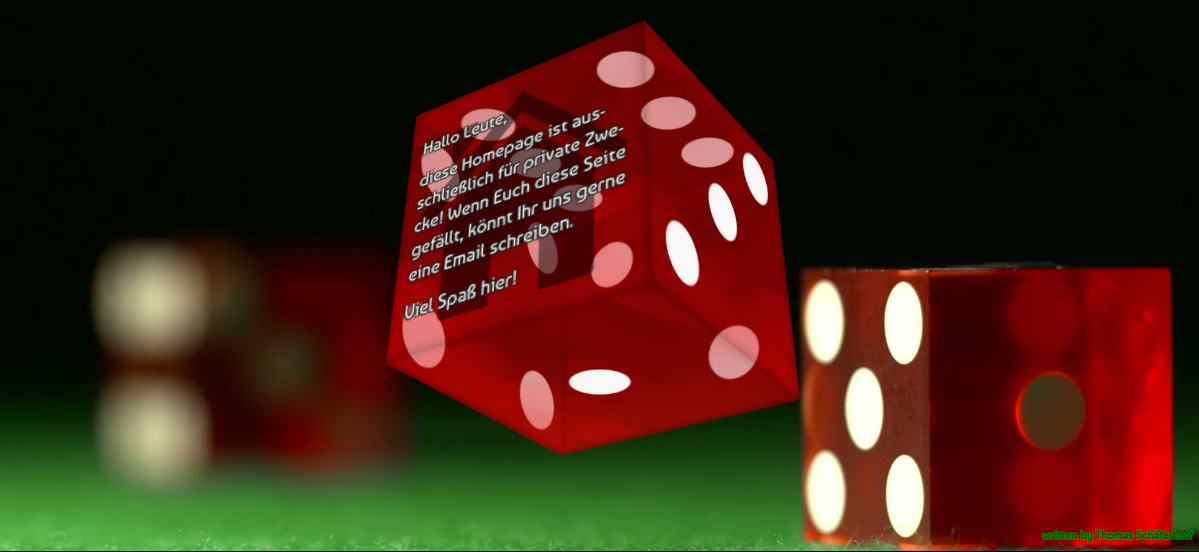
there is a single page. Of course, this homepage is not really meant for productive use, like
www.spandauer-ttc.de or www.daoyin.it, which I also wrote.
The cube design
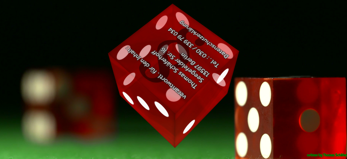
is just for the pure optics. The page looks like a crabs table and is in this way totaly different compared to other sites like www.henryaselkirk.
Despite lack of space I integrated a slideshow
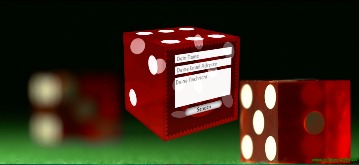
and an email form
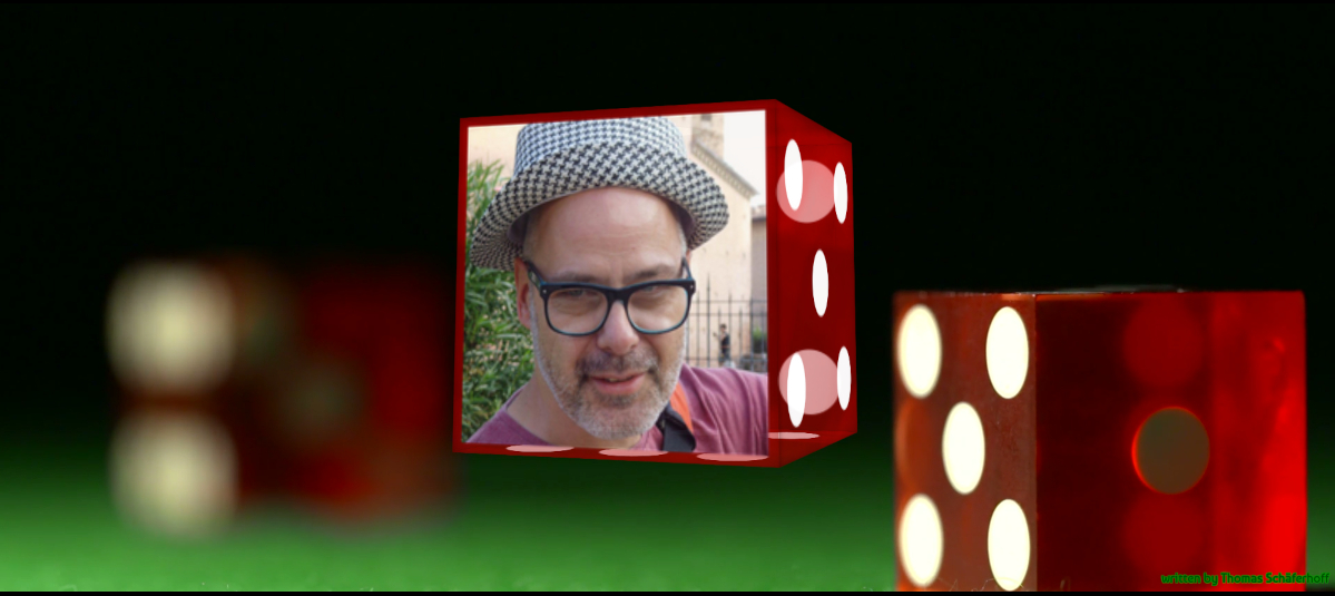
into the dice.
Here is an example video of how the site looks and works.
All in all I think that I have created an extraordinary homepage.
Best regards Thomas Schäferhoff